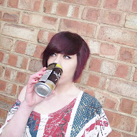
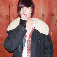
We have planned the opening and end scenes of our music video fully and have decided on where we will film them and what shot types we will use to film these particular parts of the music video. However for the actual main part of the video in which the party takes place we are creating a fast paced montage of clips that will be cut down from footage filmed during the party. There are a few party scenes that have we planned and know we definately want as part of the video, such as people drinking alcohol, people kissing, and drunken behaviour, these can be seen above in the storyboard. These are scenes we know we definately want and will film first, the rest of the scenes will be filmed throughout the night randomly.
Monday, 14 November 2011
Music promo video, full storyboard and shot types
We have planned the opening and end scenes of our music video fully and have decided on where we will film them and what shot types we will use to film these particular parts of the music video. However for the actual main part of the video in which the party takes place we are creating a fast paced montage of clips that will be cut down from footage filmed during the party. There are a few party scenes that have we planned and know we definately want as part of the video, such as people drinking alcohol, people kissing, and drunken behaviour, these can be seen above in the storyboard. These are scenes we know we definately want and will film first, the rest of the scenes will be filmed throughout the night randomly.
Thursday, 10 November 2011
Music video location recce
Before we film our music video it is important that we consider health and safety.
Are there any potential hazards that could pose a health and safety risk where your music video will take place?
Some of the scenes for our music video will be filmed in outdoor places such as wooded areas/parks. There could be hazards such as litter, branches and rocks to trip on/stand on. As it is a public area there could also be broken bottles etc that could present a danger. The main part of the music video will be filmed in a derelict building/outhouse. This could present hazards as the building wont be well maintained and may have crumbly walls, uneven floors and debris/sharp rocks laying about.
What will you do to ensure these risks are minimised?Before we begin recording in the outdoor area we will decide which parts of the area we would like to use and we will check the area for any dangers making ourselves aware of where we should avoid. In the building we will check for any unsafe areas before we begin filming, ensure everyone is aware of them, if possible correct them and clear out any dangerous mess.
Will the time of day/weather affect the outcome of the music video? Have you allowed for this?As certain scenes will be filmed outdoors the time of day and weather could have affect on the outcome of the video. Wind or rain could interfere with both the costume and makeup and the equipment and props used. Ideally it will be a clear day with not much wind. We wish to film the outdoor scenes at dusk just as the sun is setting, this will create the impression we are walking to a party which is taking place at night and also the dusky pinky tones will create a nice effect that will tie in with the grungey theme perfectly. However as there isn't much light during this time of day the filming of the scene may have be done over several days.
Have you considered lighting? What about the ‘problems’ of natural lighting, either outside, or streaming through a window? Will you need to use a flash? Have you considered reflective objects that might spoil the effect?
The main part of our music video will be recorded in a building which will have very little if any windows or light sources. We would like lowkey lighting to give the video a dingy feel however so that the people in the video are visible we will need one or two small light sources such as lamps out of shot. The section of the video that will be recorded at dusk shouldn't require too much artifical lighting if we manage to catch the natural lighting on time however as time goes on the people and objects in the shot could become sillhouetted and we would need extra lighting such as a portable lamp or torch, or even the light on the camera.
Do you need permission to record your music video in the place/venue you have in mind?We do not require permission to film the outdoor scenes in a public place however we have to be careful not to get anyone elses face or things such as number plates on cars etc in the shot as this could be seen as overlooking other peoples privacy. The building we will be using will be an outhouse belonging to a member of the group and we have full permission to use the building.
Are other people/crowds likely to be an issue for you? What have you done to ensure that it will not spoil the effect?Most of the video will be recorded indoors therefore other than those involved in the process there wont be any people around. However the scenes that we are filming outdoors could be affected by members of the public walking into shot or sitting in the area we wish to film in. The areas we wish to film in are relatively quiet, especially around the time we wish to film so this shouldn't be too much of a problem.
Are you reliant on lifts/props/friends’ equipment/models? How have you planned that these things will come together at the appointed time? We have asked quite a lot of people to feature in our video in order to create a party atmosphere and create the wild effect we wish to. We will need to ensure that everyone is free at a time that is suitable for everyone else which may take some working out. Once we have organised a day and time we are also relying on everybody still being able to turn up at the arranged time. The props being used in the video belong to the members of the group therefore we have no worries about needing permission or favours from people. The recording equipment we will be using will belong to the media department at college therefore we will need permission from our lecturer to borrow the neccasary equipment.
Wednesday, 19 October 2011
Music promo video location initial ideas (original images)
These are original images of places I think have the look I want for the location of my music video. I want to use a very urban run down looking area for the location of my music video. When watching music that I have taken inspiration from or videos of a similar genre they all seem to set in urban areas in empty warehouses etc.
Tuesday, 18 October 2011
Time management (5 weeks to go)
We have so far completed our research, came up with initial ideas for our music video, CD digipack and magazine advertisement. We also created the first drafts of all printed aspects of the coursework. After gaining feedback we have amended our drafts till final drafts we were happy with and gained positive feedback from were succesfully produced.
There is currently 5 weeks to go till deadline and we have now turned our attention the creation of the music video. We have already planned; the genre and conventions which will be included, initial plot ideas, costume and makeup, the soundtrack, character/behaviour and rough storyboards and shot types.
During the next 5 weeks we will; decide upon a definate location to shoot the video and consider health and safety, aqquire props we will need, film the neccasary scenes for the music video, and finally edit the film and add the soundtrack and effects.
Monday, 17 October 2011
Storyboard and shot types
As a group we discussed what scenes we could include in our music video and analysed similar videos for common reoccuring scenes. We wrote a list of scenes, which can be seen above, that we feel would be appropriate and would fit in our video well.
This is the first 10 shots of our music video taken from the overall storyboard. This includes a thumbnail sketch of what we would that particular scene to look like, the shot type and camera angle. As well as a brief description of whats going on in that scene. Storyboarding the scenes before we go into filming is useful as it helps us thoroughly think through what camera work we would like to use and also helps us know what we want to acheive from filming.
Sunday, 16 October 2011
Magazine advertisement fourth and final draft
This is the fourth draft of our magazine advertisement. This is pretty similar to our third draft as we haven't changed the layout or background images but we replaced the image inside the CD case and the watermark on the IPod screen with the amended CD cover containing the new image. As a group we are very pleased with this magazine advertisement and would like to use as a final part of our digipack.
Saturday, 15 October 2011
Inside sleeve second and final draft
This is the second draft of the inside sleeve for our digipack. We were pleased with the outcome of the first draft however we hadn't taken the photographs to place inside the poloroids at that point in time. We chose our favourite personal image and edited them creating a vintage effect for our poloroid. We havn't changed the layout as we were happy with the overall look, the only difference we have made is removing one of the poloroid frames as this was going to contain the image and name of the member that is no longer a part of our group. We are very pleased with this and would like to use this as part of our digipack.
Friday, 14 October 2011
CD Front Cover second and final draft
This is the second draft of our front cover for our CD. Although we were pleased with the first draft of our front cover after feedback from our lecturer it was brought to our attention that the image could be more controversial to tie in with the theme and after creating the other aspects of our digipack the front cover no longer seemed consistent with the package. We used the image we best felt fitting with our genre and placed it in a poloroid making it consistent with the inside sleeve, and made the background similar to that of the back cover.
Thursday, 13 October 2011
CD Front cover amended photo shoot and Inside sleeve photoshoot
After gaining peer feedback and feedback from our lecturer it was a common opinion that the images we had weren't controversial enough, and we also had a change in group members. We did another photo shoot, again using an outdoor background and using props such as alcohol and cigerettes but we have taken the photos whilst it was dark in order to create more of a back garden of a house party effect. We also took the images for out inside at the same time as the amended front cover photographs.
Amended front cover photographs These are the group photos we took to use for the front cover. We feel all the images came out well and were consistent with the theme however we feel the first image came out the best and looked the most realistic and controversial.
---------------------------------------------------------------------------------------------------------------
Amended front cover final chosen photograph This the image we have chosen and will be using on our front cover
---------------------------------------------------------------------------------------------------------------
CD Inside sleeve tester photographs
These are photographs that were taken during the day in cally's backgarden whilst doing other coursework to test use of props, body language and poses. Taking these photos gave us and idea of what would look good and what wouldn't in our images.
---------------------------------------------------------------------------------------------------------
CD digipack inside sleeve photographs These are the individual photos that we took after taking the group photos to use for the poloroids on the inside sleeve.
-----------------------------------------------------------------------------------------
CD digipack inside sleeve final chosen and edited photographs We each chose our favourite photo of ourselves from the images above, and the photo that as a group we decided best fit with the theme and then edited them to look like distressed poloroids from a house party that you would find lying on a teenagers desktop.
--------------------------------------------------------------------------------------------------
Wednesday, 12 October 2011
Magazine advertisement third draft
This is the third draft of our magazine advertisement. We have made a few changes after receiving feedback on how to improve from our lecturer. We added a review and quotation from Kerrang Magazine onto a playing card. We chose to use Kerrang Magazine as it is a popular magazine amongst teenagers, especially ones that our chosen genre would appeal to. Therefore seeing a magazine they like push the music will encourage them to listen to it. We also added a faded out thumbnail of the album cover onto the IPod to make it look more realistic. Lastly we added endorsement logos from popular brands. This is quite common on advertisements and brands that wish to sell amongst a particular market usually endorse projects which will appeal to the market so we picked Pepsi and Blackberry as both these companies are popular amongst teenagers.
Tuesday, 11 October 2011
CD back cover first draft
This is the first draft of our back cover for our digipack. We are pleased with the outcome and how similar it is to the what we imagined when drawing up the flat plan. We have added a copyright disclaimer to the bottom left of the cover and website url's to the top left. We found these two things to be very common when researching other back covers.
Monday, 10 October 2011
Inside sleeve first draft
This is the first draft of the inside sleeve for our digipack. We feel that our idea has turned out pretty will and it fits with theme creating consistency throughout the digipack. We wanted to create an image that represented a teenagers desktop and when we drew up the flat plan we were sceptical about whether it would turn how we pictured or whether it would appear cartoon like and look animated. We gathered images from the internet and placed them together on photoshop trying to keep as much realism as possible. We will add single pictures of each member of the band inside the poloroid once the images have been taken and edited.
Sunday, 9 October 2011
Feedback, front cover first draft and magazine advertisement second draft
Now that we have completed the first drafts of our Cd cover and magazine advertisement our lecturer assessed what we had produced so far and gave us feedback. Both our print tasks were graded at B, meaning were working on target.
The positive feedback we recieved for our CD cover was that the body language and look of the image was relevant and showed a knowledge of the target audience and that the image and text were intergrated well. The criticisms we recieved for out CD cover were that the image could more controversial and we could make it more relevant to the theme and target audience, and that the text could stand out more, perhaps add an effect to it.
The positive feedback we recieved for our magazine advertisement was that it was very quirky and appealing and we showed a good knowledge of conventions and our target audience. In order to improve the advertisement it was suggested we could add reviews of the single to the page.
To improve our grade we should consider retaking the photos and making them more controversial and we should complete the drafts for the rest of the digipack.
Saturday, 8 October 2011
Magazine advertisement second draft
This is the second draft of our magazine advertisement. We have made no changes to the actual advertisement as we were quite pleased with it, but now the photoshoot and CD cover have been completed we have dropped in the picture of the CD.
Friday, 7 October 2011
Cd cover first photoshop draft
This is the first draft of our CD Cover. We created this using photoshop. We took the best images of each of us individually and placed them together to create a image we were all happy with. Then we added the text and finally used the tools and brushes to create a vintage overlay effect on the image. This is inkeeping with our product as the image is supposed represents the band members as off the rails teenagers after a party, and the vintage overlay effect adds to the worn out after party feel.
Thursday, 6 October 2011
Magazine advertisement first photoshop draft
This is a first draft of what we would like the magazine advertisement to look like that was created using photoshop. Our ideas have come together nicely and the overall look of the advertisement is one we are pleased with. Once the CD cover has been created, the picture will be dropped in onto the CD case which will complete the advertisement.
Tuesday, 4 October 2011
photo shoot location recce
Before we begin our photshoot it is important we consider health and safety;
Are there any potential hazards that could pose a health and safety risk where your photo shoot will take place?As we are taking our photographs outside, in one of the members gardens we have little control over the environment, things like uneven paving, gravel and ornaments could all pose potentional health and safety issues such as trips and falls. Props that we have brought into the garden such as cigarettes and glass bottles could also pose health and safety risks such as cuts and burns.
What will you do to ensure these risks are minimised?In order to minimise these risks we will pick an area of the garden that is free of ornaments plant pots etc. We will also clear the area the best we can removing any potentionally dangerous litter and taking care around th gravel. We will also be careful to not drop any glass bottles and not let the lit cigarettes come into contact with hair, clothes and skin.
Will the time of day/weather affect the outcome of the photos? Have you allowed for this?As we are taking the photographs outside we are reliant on it not raining and it not being windy as this will ruin the overall photographs, the costume and the makeup and make it diffucult for us to acheive the effects we wish to. We will be taking the photos late afternoon so we will be reliant on natural light sources and wont need any extra lighting.
Have you considered the background to your photos, particularly if taken outside? How will you ensure you will get the background you want?The background we will be using will be a garden fence. We will be using the fence surrounding one of the members gardens as we have all agreed that this would be the best background to create the image we would like.
Have you considered lighting? What about the ‘problems’ of natural lighting, either outside, or streaming through a window? Will you need to use a flash? Have you considered reflective objects that might spoil the effect?As we will be taking the photographs outside we will relying on natural lighting. We will have to ensure that we take the pictures in an area where the natural lighting doesn't negatively effect the images such as causing a glare on the images affecting the quality or creating unwanted shadows ruining the image.
Do you need permission to take photos in the place/venue you have in mind?We will be taking the photographs in the back garden of one of the group members, we have full permission from her and her mum to use the back garden as the backdrop for our images. This is more conveniant than using a public area as the backdrop as we have more control over the manipulation of the surroundings and we can choose times that work best for us.
Are you reliant on lifts/props/friends’ equipment/models? How have you planned that these things will come together at the appointed time? Plan B?The camera that will be used to take the photo's will be the personal camera of one of the group members meaning we can access the camera and download the images from it at times conveniant for the group rather than relying on others, however we will have to borrow a tripod from the media department which could mean we have to plan when we take the photos around when it is available. As all the group members are friends outside of college and live near each other and the location for the photographs is the house of one of the group members we have all arranged a time that works for us and should a problem occur where this time cant be stuck to by every member communication and re-arranging the photoshoot wont cause a problem.
Monday, 3 October 2011
Photoshoot planning
Before we begin the photoshoot for our CD digipack we must create a plan first to ensure that we know what image we would like to create, what location would be best to use and what props, costume and equipment we will need;
What emotional impact do you want your photography do have upon the reader? How?We would like our photos to have a very dramatic effect on the viewer. As the music promo video is a party and will involve teenagers taking part in controversial behaviour that would be seen as innapropriate to most people we would like to create the image of wild off the rails youth in our images. We will do this by having an image consistent with the video and having the members of the group taking part in controversial behaviour in a party type setting.
What personnel do you need? Who are you going to photograph?
The image will feature the members of the band. We felt this appropriate as it is a common convention of CD covers to feature images of the artists and also it allows the cover to be easily recogniseable to people as belonging to the band.
What props will you need?As we want the image to be consistent with the music video we will need props similar to those that will be used in the video to create the party scenes and give the impression of wild youth such as cigarettes and alcohol.
How are you going to emphasise colour?The majority of the colour on the printed aspects of the digipack will come from the text and backgrounds the images are placed with. To stay within conventions of the genre the costume of the photoshoot will be made up of mainly dark clothing however having an item of clothing, hair or makeup in bright block colours is a common convention, the background the image will be taken against will be quite plain which will contrast with the block colours used in the photo and the bright colours used for the text and backgrounds.
Have you briefed your personnel/models?The models that will be used in the photographs will be the members of the group. This means we dont have to rely on other people, gain their consent, work our scheduale round their free time and the members of the group already know what kind of look we want to create as they were involved in the planning.
What lighting will you need? Any other equipment?We will be using natural light sources whilst taking the photographs, however if it gets cloudy or overcast and we lose a lot of natural light we can use the outdoor-cloudy flash setting on the camera meaning we have the right amount of light for the image to look good in the particular surroundings. The only other peices of equipment we will need to take the images will be a tripod to stand the camera on to use a self timer setting, this ensures all the group members can be in the image and we arent relying on someone else knowing how to use the camera correctly.
Where will you shoot? Will you need a backdrop?We will be shooting the images outside and we opted for a fence or a wall as our background for the image rather than an artificial backdrop. This ensures consistency to the theme and music video as it will make the images appear natural as if they have been took at a party in someones back garden.
Make-up? Costume?As can be seen previously in the makeup and costme research the fashion side of the photoshoot will be heavily influenced by the indie/rock genre. The costume and make-up ideas we have picked are typical of that of a band of this genre and is popular with the target audience. This gives us appeal to our target audience and adds realism to our package.
Sunday, 2 October 2011
CD cover photo shoot (original images)
These two images were tester shots taken by Cally to check that the camera was positioned correctly and the places and poses we were stood in looked good.
This was the first image we took as a group using the timer setting on the camera. The image came out blurry as the flash setting was wrong.
These were the final images that we all agreed were good enough to be used on the front of our CD cover. As not everyone was happy with how they looked in the same photo we decided to pick our favourite image of us from one of the photos and photoshop them together to create a final image we would all be happy with.
Saturday, 1 October 2011
Magazine advertisement flat plan
Rationale questions
The magazine advertisement will use a range of colours. The backgroud will be a variety of bright colours, this will make the advertisement appealing and eye catching so that when people are flicking through the magazine they will be drawn to the ad. The text "out now" will be in white, this will contrast with the bright colours used in the background and ensure it is readable.
The advertisement is inkeeping with the theme of the video and CD cover ensuring consistency throughout the package and is appealing to the target audience. The background of the ad is covered in brightly coloured paint splats which reinforces the urban theme. Single reviews have been featured on playing cards and the words "available on Itunes" will be featured on the screen on an Ipod which inkeeps with the teenage theme and will be appealing to the target audience. They layout of the ad is also inkeeping with the theme as its quite colourful and looks unorganised, whilst at the same time being visually pleasing.
The font used on the magazine advertisement will be, Nova Solid, the same font as used on the CD cover. This font was chosen as it's rather unusual so if it caught someones eye while they were flicking through the magazine they would be likely to give it a second look and notice the advertisement. Also using a consistent font means this font will then become associated with your brand name and will make it easilyy recogniseable to people.
There wont be much text on the advertisement as it's quite busy and colourful so putting too much text on the page could lead to it looking cluttered, so the small amount of text that will be used will be effective. The ad will feature reviews of the single from popular music magazines, this will ensure the readers that the single is worth listening to and buying if a well known magazine is backing it. It will also feature the text "available on Itunes" and "available instore from HMV". Using these two brands to promote and sell the single will be effective as they are well known and popular brands amongst the target audience. The ad will also feature the words "out now", this phrase is being used rather than adding a specific release date as it is an imperitave and infers a sense of urgency in the purchasing of the single.
The CD cover thumbnail will be placed in the centre of the ad as this is the immediate focal point to which your attention is drawn. This will ensure the reader notices the CD cover and memorises what it looks like.
Friday, 30 September 2011
Back cover flat plan
Rationale questionsWe have taken inspiration from the back covers we looked at and took our theme and target audience into consideration and came up with a design that will look like this. The colour scheme will be vibrant. The background will have bright colour paint splattered all over it giving it a youthful urban feel and the cigerettes will be vibrant and stand out against the background.
The background image will be wooden effect, this is consistent with the front cover as the pictures have been taken against a wooden fence and the inside sleeve as the image is of a wooden desk. The paint splatters on a wooden background is relevant to the target audience as it creates quite an urban feel as if the fence has been grafittied. We will also be using cigerettes to place the song titles onto, this again reinforces the theme and appeal to the target audience whilst making the cover slighty more controversial, sticking to conventions of our genre.
We will be placing the song titles on the cigerettes, although we feel this is a good idea and will work well with the theme we will have to ensure that the font and colour of the text is readable against the background of the cigerette. We will also be putting website url's and a copyright disclaimer on the cover, this is a common convention and including website url's allows us to relate to the target audience through technology as they will then go to the website.
The layout of the back cover will be neat enough so that text can easily read but the cigerettes will be placed in a scattered fashion to give the impression they've all fell there. This inkeeps with the theme, generic conventions and appeals to our target audience.
Thursday, 29 September 2011
Inside sleeve flat plan
Rationale questionsWe have taken inspiration from the inside sleeves we researched and came up with a design that will look like this.The colour scheme will be overall quite dingy, this is because the image is meant to represent the wooden bedside table or desk of a tennager. This means it will consist of earthy colours coming from the wood, money, ashtrays, cigerettes etc.There will be the occasional bright colour from gig tickets wristbands etc.
The image on our inside sleeve will be made up of smaller images. We wish to create an image that looks like a photo of a teenagers bedside table or desktop taken from above and will include things like money, cigerettes, lighters and gig tickets. We will also be placing original images of the band members in poloroids and scattering them across the page to look like photos taken at a party.
There wont be much text on the inside sleeve as it's made up mainly of imagery. The only original text that will be used on the inside sleeve will be the names of the band members underneath the images on the poloroids. The reasoning behind putting the band members names under the images is to relate to the audience on a more personal level. This reinforces the fact that the band members are average teenagers that fans can relate to.
The layout of the inside sleeve will be quite busy without looking overcluttered. As the image is meant to represent a teenagers desktop things will be scattered and placed randomly. To create this messy effect we will place the images together in photoshop but arrange them neatly enough for the image not to become to fussy. Using this idea and layout will again make it easy for the audience to relate to the band and the record and will appeal to them.
Wednesday, 28 September 2011
CD Cover flatplan
Rationale questions
We have taken inspiration from the CD covers we looked at and have came up with a final design that will look like this. The cover will contain a lot of bright colours from the main image so the backdrop will be outdoors against a fence. This will contrast with the bright colours and ensure the overall isn't to garey.
The main image on my CD cover, will feature the band members standing against a fence backdrop. This is to ensure the backdrop is simple in comparision with the main image and props used. The props used in this image will feature bottles of alcohol, party poppers, balloons etc to give the image a party theme. This will ensure consistency throughout the package as the cover will relate to the video. The costume will be fitting to the genre of music and will be based on the indie/hipster fashion. This will appeal to the target audience as it is relevant to their music and fashion intrests. The image will be taken at an eye level shot. This will ensure the band members are the centrepoint and main focus of the CD cover. After the main image and text have been positioned there will be a vintage overlay effect added. This will discolour the edges and lower the saturation of the image, this will add to the partied out effect the image has and is also inkeeping with the indie trend.
The font used on the CD cover will be Nova Solid and will be in white. This will ensure the text is readable but does not distract focus away from the image. It also inkeeps with the basic colour scheme of the background and surroundings of the main image. The text will be positioned above and below the image to keep focus on the image at the centre.
Tuesday, 27 September 2011
Copyright permission
As we have decided to use an existing peice of music that has been produced by a signed artist for our media project, it is important that we gain permission as to not infringe any copyright laws.
After some research on the internet we found the label that Does It Offend You, Yeah? are signed to and that own the rights to the record we wish to use and contacted them for permission.
We went to the contact page on Cooking Vinyl's website, this means the email we send will go straight to their server and the chances of it not being recieved are smaller. In the email we told them that we are required to produce a music video as part of our media coursework and we would like permission to use that particular song. This ensures we wont be breaking any copyright or infringement laws if we were to let the publc view our video or we put it on sites such a YouTube or Facebook.
Monday, 26 September 2011
Music promo video soundtrack
We felt creating our own peice of music would have been to time consuming and difficult considering the limited time we have to produce the coursework. We chose to use an existing song from our chosen genre. After discussing it as a group we decided to use We Are Rockstars by Does It Offend You, Yeah?.
We chose this song as represents our chosen genre and theme and will work well as audio to our video and will be popular amongst our target audience.
Sunday, 25 September 2011
Music promo video, initial ideas synopsis
After the research we have carried out and the initial ideas we have already came up with we talked about and wrote down our ideas for the music video.
The plot of our music video revolves around a group of teengers partying in a derelict building or an empty house. The music video will begin showing the aftermath of the party and will play in reverse going right back to the beginning of the party. The idea of doing the video in reverse appealed to us as showing the messy aftermath will provoke curiosity in the audience and they will want to watch the video all the way through to see the events leading up to it. Also putting the video in reverse will allow us to use visual effects such as bottles bouncing back up into hands and smoke being inhaled back in rather than blown out. We will also be using a variety of shot types and editing such as zoom and blur. This will emphasize the intoxicated state of the teenagers. We also want to spray paint the words "we are rockstars" on walls to reinforce the relevance of the video with the music.
Saturday, 24 September 2011
Peer feedback
This is a scanned image of the anonymous feedback I was given from my peers about my blog. Overall the feedback I was given for my ideas and development was positive and I am happy with how my research and ideas are coming along.
Friday, 23 September 2011
Characters
The music video will feature members of the band and other teenagers partying. As the video has no actual storyline, there are no individual characters. However every person in the video will give the impression of being a wild, off the rails teenager. The characters portrayed in the music video will have characteristics similar to those of the characters in the tv show skins, as can be seen below in a trailer for the programme.
Photoshoot ideas
For both the front cover and inside sleeve of out CD digipack the design ideas we have require us to have original images of ourselves. To ensure consistency throughout our products and to make it relateable to the target audience we want the original images controversial.
For the front cover we would like to use a group image of the band, this will allow audiences to recognise band members and know who the album belongs to and is also a common convention for album artwork.
These are a few images we like as inspiration for the front cover. As our music promo package has a party and out of control youth theme we feel the images should represent this and be consistent with the theme. The images will include aspects of a house party such as alcohol, smoking and controversial behaviour.
For the inside sleeve we would like to use individual images of each member of the band as if they had been taken at a house party.
These are a few images we gathered that we feel represent the ideas we have for the inside sleeve and we could take inspiration from. We feel the behaviour being displayed in these images would be relevant and we would like to recreate similar images. We also like the effects used on the photographs and feel it would look good if we used a similar effect on our images and placed them in poloroid frames.
Subscribe to:
Posts (Atom)